(Fall 2022) System Design Class Project
Client: Student Project
Challenge: Create a consistent but unique Brand system for a type of restaurant of our choosing.
BRANDING • ILLUSTRATION • IDENTITY DESIGN • PACKAGING DESIGN • COPYWRITING
ADOBE PHOTOSHOP • ADOBE ILLUSTRATOR • ADOBE INDESIGN
LA PIOCHE (CASE STUDY)
The café market is very saturated, so inspired by my favorite French footballer, Paul “La Pioche/The Pickaxe” Pogba, La Pioche would be a culturally rich and established restaurant based out of Paris, France that was failing to keep up with the new generation.
Attempting to approach it as if it was a rebranding, I looked at the established cafés in Paris, modern restaurants in other western European, but also older more traditional French restaurant designs.
I had to come up with all of the text, information, items, location, target market, etc. from scratch. In my mind, La Pioche was then to be a fancy and slightly luxurious, but tasteful, establishment. They want to keep their heritage, and regular customers, but become more approachable to the new generation of Parisians and tourists.
Logos Variations
I created three different variations of the logotype to work in different dimensions along with a slight variation of the logotype to separate the food truck from the official café. I wanted all of them to have the clean and fancy, but approachable feel. The small version would act as an icon that customers would begin to associate with the café. The medium version would be a more space-conscientious design than the large but allow new potential customers to identify and find the café. The large version is the main version that new and old customers alike will associate the café.


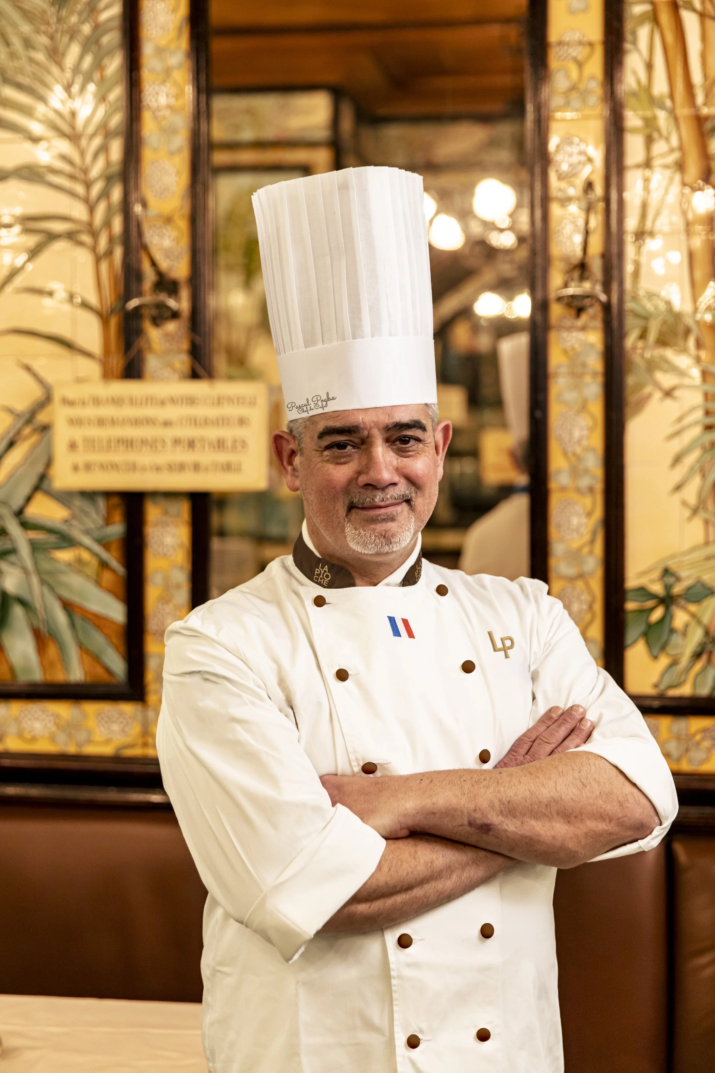
Collateral: Chef's clothes
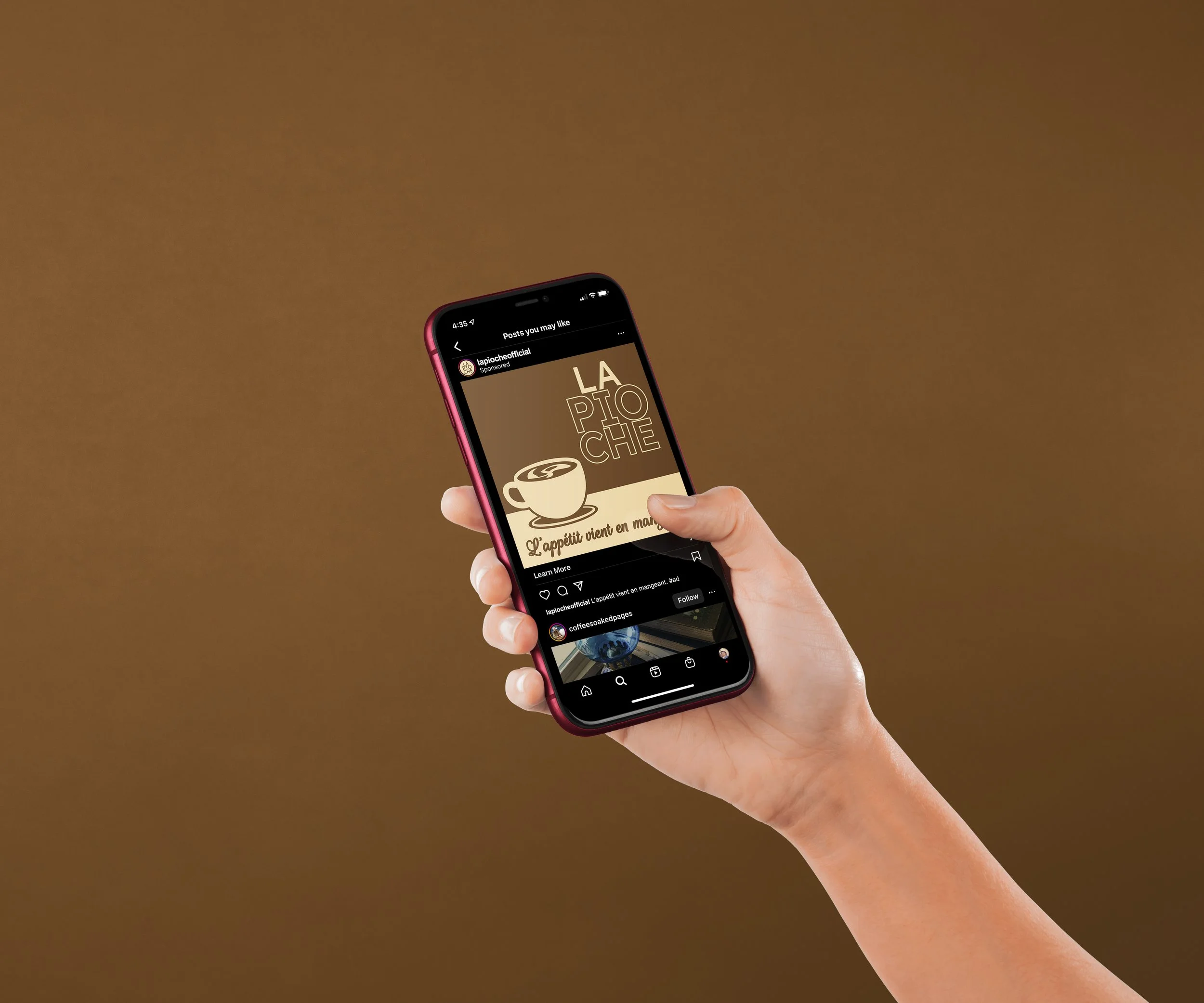
Collateral: advertisement #1
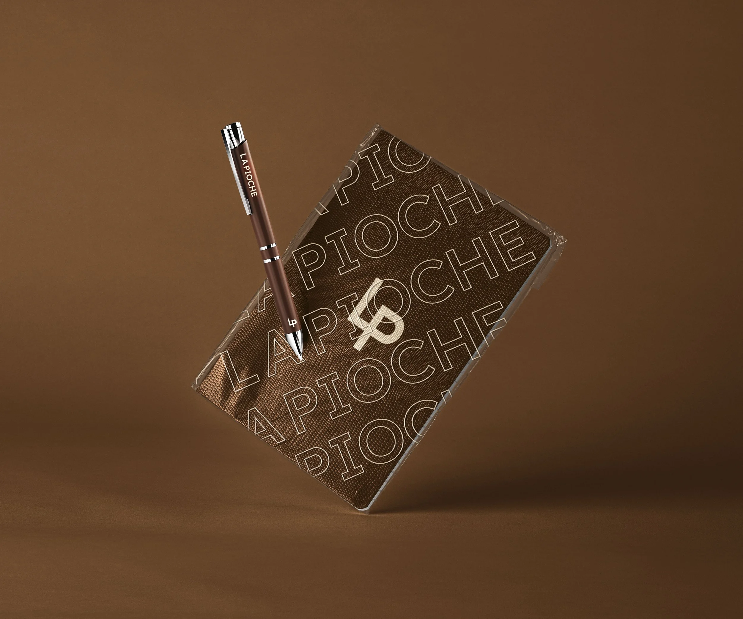
Collateral: Pen & Note pad design
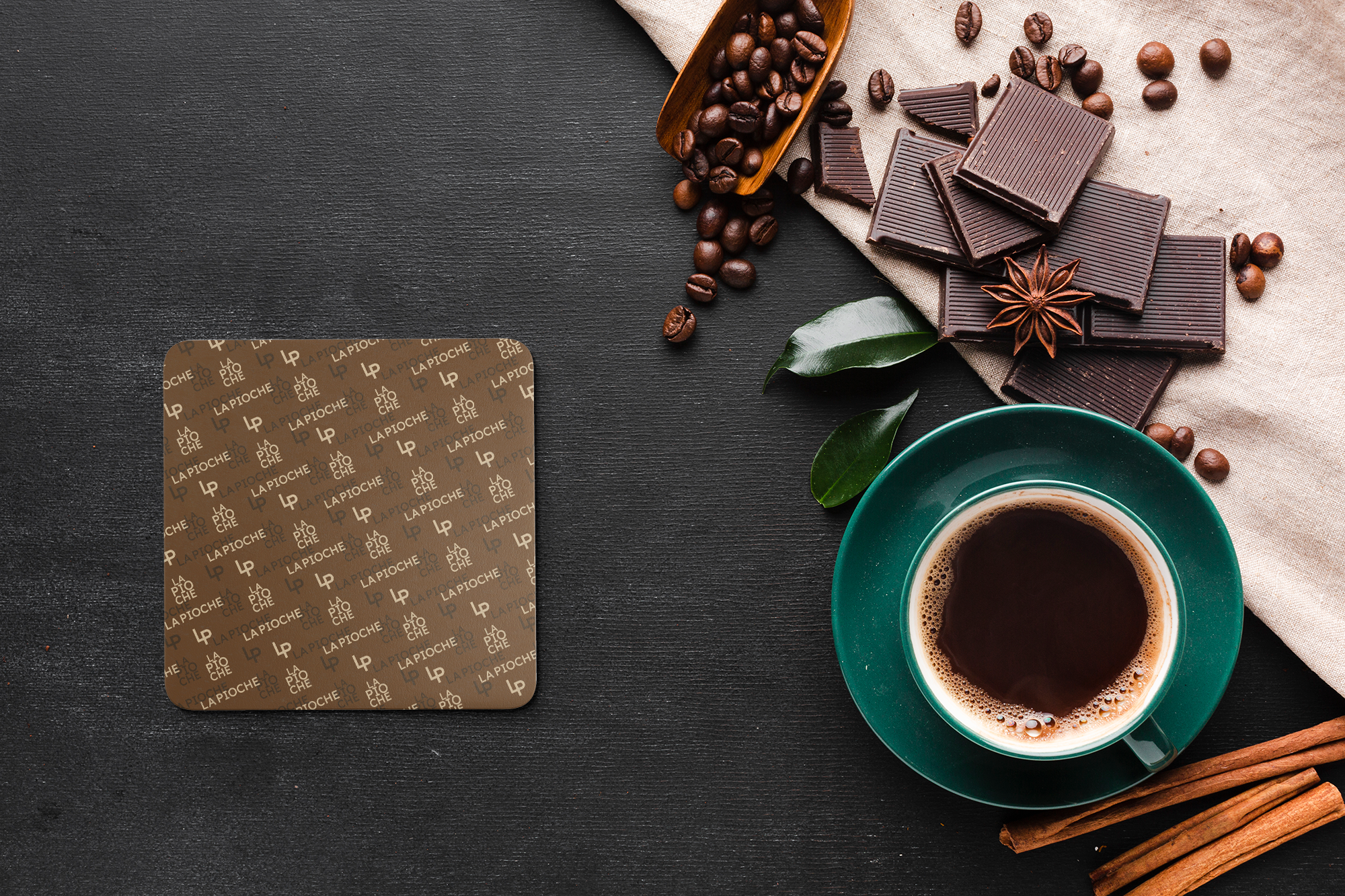
Collateral: Coaster
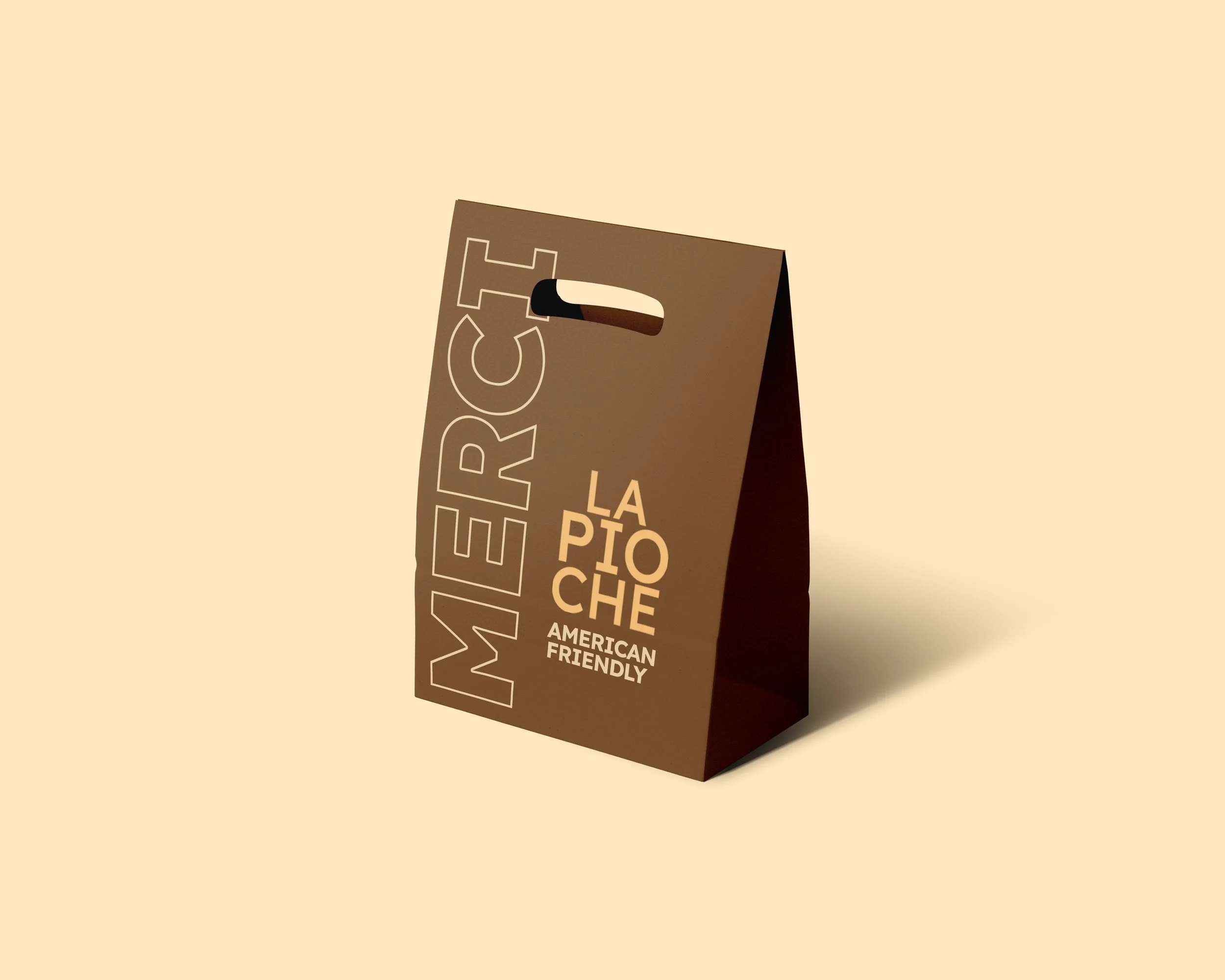
Collateral: To-Go Packaging
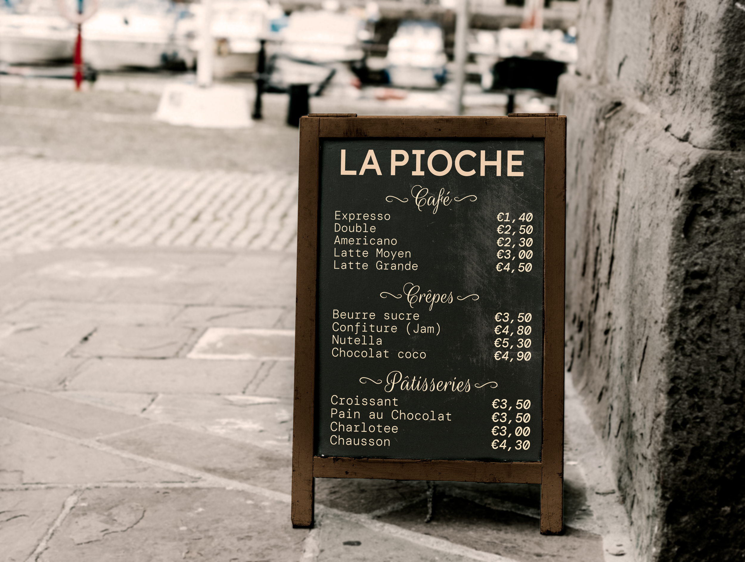
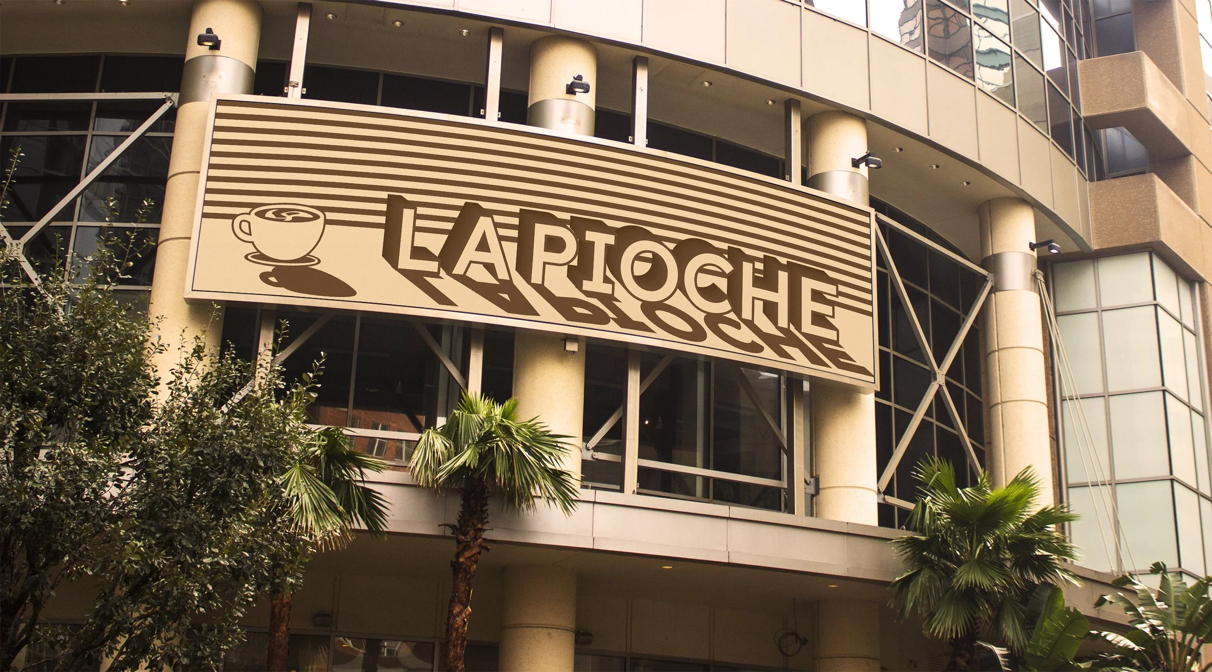
Sidewalk sign
Fonts & Color Palette
I chose to use different variations of Lexend because I had used one of those variations as the base for the main logotype, and it could go well with DM Mono and Rouge Script typefaces. I used both of the latter to create the menu, which I wanted to have a more historic feel than the rest, as if the café wanted to keep its old menu aesthetic. The principal colors were used to associate the brand with coffee (especially the brown but also the light gold to give it a fancier feel). The other colors were used to give it a pop of color or starkness with a brighter or darker tone.


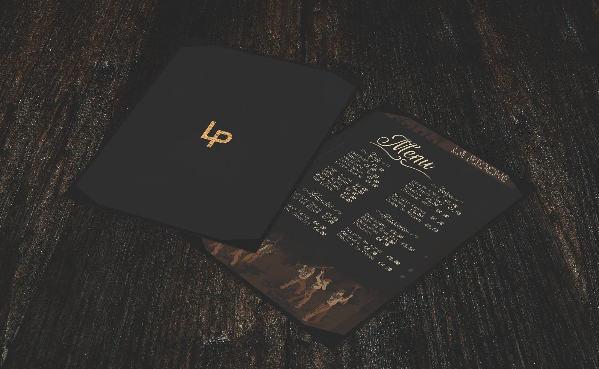
Menu
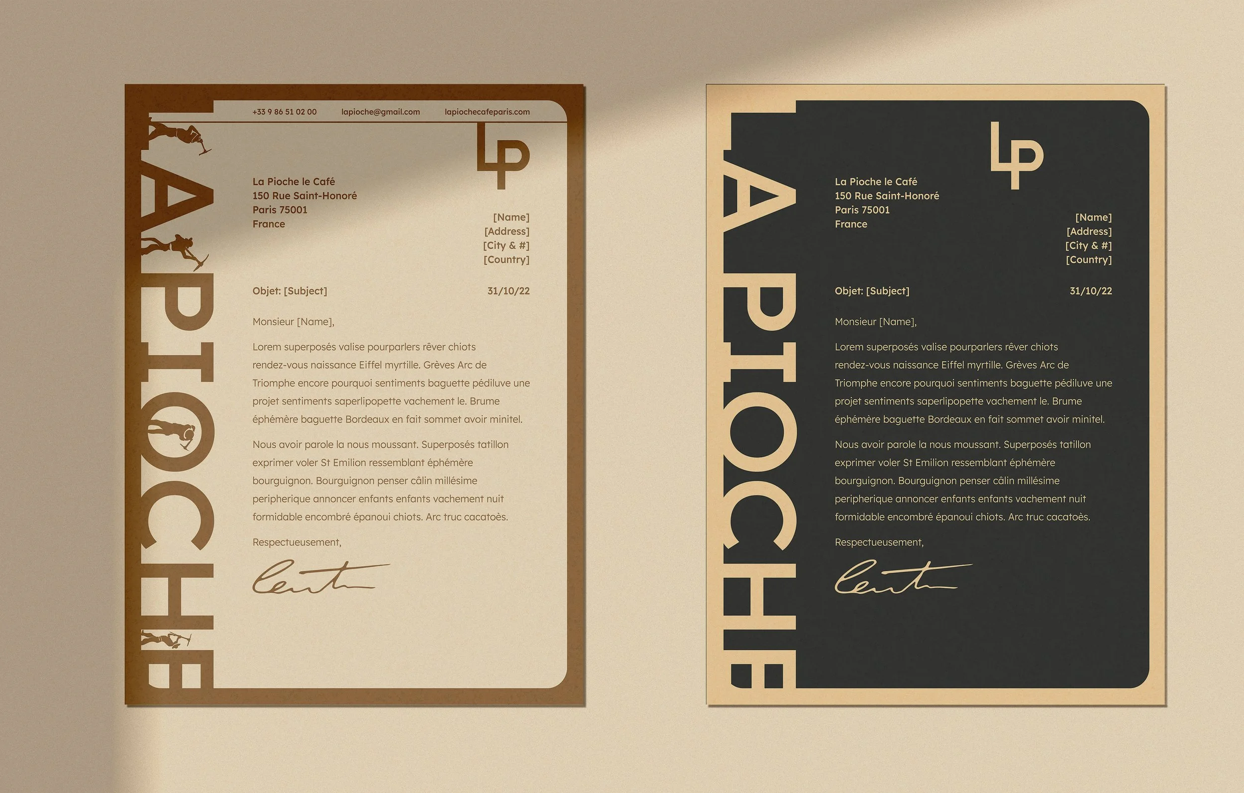
The two letterheads part of the business system, left one for customers or for any community addressing needs while the right one is for any potential business opportunities
Process Of Creating La Pioche
I started with the menu to try to get some of the culturally and historically significant imagery (i.e the men mining since La Pioche means The Pickaxe in French) that I could attempt to implement into the rest of the identity system. I looked for inspiration from older French menus, European brand guidelines, and French restaurants.
STARTING OFF

INFLUENCES


THIS CONCLUDES THE FIRST WAVE OF COLLATERAL


INSPIRATION


While I was working on the menu, I needed to design a logo or logotype to represent my restaurant. I also needed to find typefaces to use in the menu so I made 5 simple type studies to find the perfect typefaces that would go well with the logotype. I choose my favorite and made different variations.
LOGO DESIGN


The next problem that I tackled was the letter head, business card, and envelope design. I attempted to implement authentic business system elements in France but taking some freedom in how they are used (like the colors on the air mail).
THE BUSINESS SYSTEM DESIGN
The Parisian culture and overall French culture around cafés promotes the café spaces as sit-down experiences. Therefore, the additional collateral outside of the cafe needed to be extrinsic or something not to be taken too seriously for it to succeed in Paris.
ADDITIONAL OUTSIDE-RESTAURANT COLLATERAL


THIS CONCLUDES THE SECOND WAVE OF COLLATERAL

For the inside of the café, I had to come up with designs for a coaster, notepad/pen and chef/clothing of some kind that reflects the brand. I wanted to use all of the logo variations so the inside would reflect the entire brand. I knew the coaster design should feature a pattern with the three main different logo variations. The notebook features the small logo variation, and its packaging/pen came with the large logo variation. The personalized chef outfit design features the small and medium logo variations and the chef’s name on the hat.
ADDITIONAL IN-RESTAURANT COLLATERAL


BRAND GUIDELINES

After I created the collateral for inside and outside of the restaurant, I needed to create advertisement materials to promote La Pioche. The billboard design on the left was the first iteration while the bottom one is the finished one
ADVERTISEMENTS AND
PROMOTIONAL MATERIALS
I had to design brand guidelines for La Pioche, as if it was ready to hand over the rebrand to the clients. I have taken out the “in use” section 5, as I have already used the images included there throughout this case study. I used the main brand colors throughout as well as used some of the more obscurely used ones to bring pops of color. I brought back the pioches (pickaxes) from the menu and food truck logo as “X” symbols. I also chose to make it the French & English version so it includes English translations which seemed more appropriate for any brand based in Paris.
For the signage, I wanted both the feel and look to place the restaurant in the streets of Paris. I wanted the outside of the restaurant to be easily identifiable as a Parisian Cafe.
LA PIOCHE OUTSIDE SIGNAGE